Problem
When I first looked at ShopGoodwill.com, I saw a tension: the site had decades of content and features, but the user interface felt cluttered and inconsistent. It wasn't clear whether users always understood where they were in the flow, if controls and labels matched their expectations, or how easy it would be for them to recover from errors. In short: usability problems were creeping in unnoticed, and the product team lacked a clear diagnostic lens.
The challenge I took on was: How can we uncover key usability issues across the site—especially hidden ones—and produce actionable guidance to improve the experience?
To refine it further, I asked:
- Which parts of the interface violate core usability principles?
- Which violations are most harmful?
- How can we prioritize fixes so they're meaningful and feasible?
Process
Scoping & Heuristic Framework
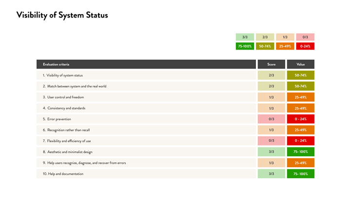
I started by defining a heuristic evaluation framework. Drawing on established usability heuristics (such as visibility of system status, user control, error prevention, consistency, etc.), I translated each into three supporting usability rules (e.g. “status updates should be visible until task completion”) and paired them with severity levels to measure how serious each violation was.
I scoped the audit to ShopGoodwill.com (an e-commerce auction site where you can buy items locally or remotely) and chose ten heuristics to apply across key flows: browsing, bidding, buying, account management, etc. This provided a structured but flexible lens to evaluate strengths and weaknesses.
Evaluation & Documentation
I walked through the site, systematically applying each heuristic and rule. For every interface element (button, form, message, navigation), I asked:
- Does this violate a heuristic rule?
- If yes, how severely (minor annoyance, major obstacle, critical breakdown)?
- What’s the root cause and how might it be addressed?
I captured annotated screenshots, notes, and severity scores. The visual annotations helped stakeholders immediately grasp where the problem was, how it manifested, and why it mattered.
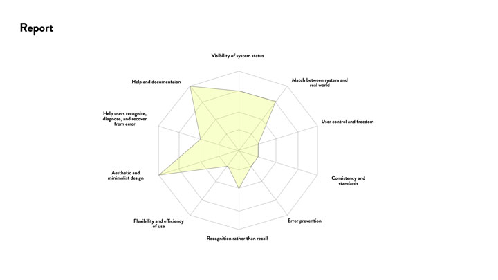
As I went, certain recurrent themes emerged:
- Visibility of system status: users often didn’t get feedback after submitting actions, causing uncertainty.
- Match between system and real world: many labels, phrases, and flows felt too technical or did not align with user expectations.
- Error prevention and recovery: error states often felt abrupt or cryptic (e.g. “error 500”) rather than offering paths to recover.
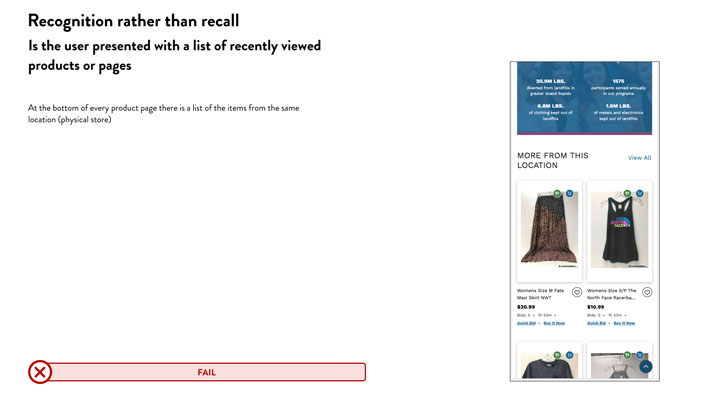
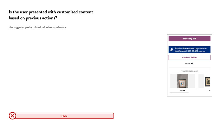
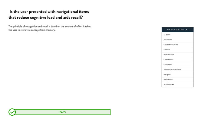
- Recognition rather than recall: options, navigation, or instructions were sometimes hidden or required memory rather than being visible at the moment of need.
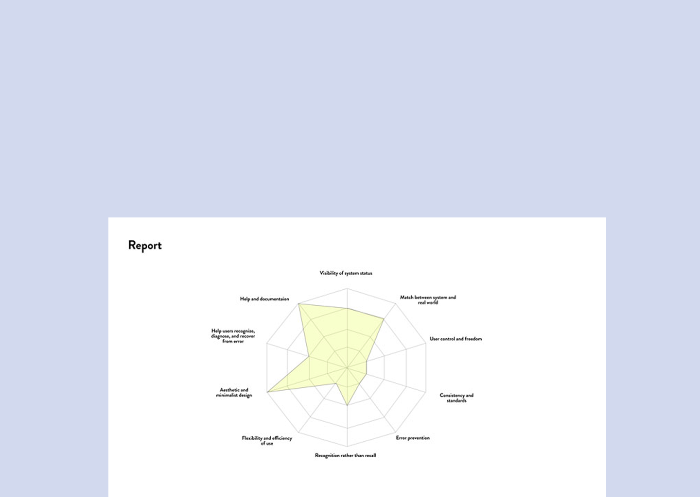
I grouped issues by severity and frequency, then structured them into a report that combined narrative descriptions, annotated visuals, severity mapping, and prioritized recommendations.
Impact
The heuristic audit delivered immediate value:
- Clarity for stakeholders: The annotated report surfaced usability gaps that even internal teams weren’t fully aware of. It gave product, design, and engineering teams a shared vocabulary and prioritized roadmap.
- Actionable fixes: The site team could begin with high-severity issues (e.g. missing feedback on submission, confusing labels) and embed usability improvements into upcoming sprints.
- Better alignment with user expectations: By rooting suggestions in well-known heuristics, recommendations resonated with both designers and engineers, reducing pushback.
- Efficiency in discovery: Compared to broad user testing, the heuristic method surfaced many low-hanging usability issues quickly, offering a high ROI for early-stage improvements.
While this heuristic audit doesn’t replace user research or usability testing, it complements them—especially early in the process—by helping teams catch common errors before they snowball.
Reflection
This project reminded me of the power of a structured lens. Without heuristics, it’s easy to wander through a site and flag random annoyances; with heuristics, you bring a diagnostic mindset that surfaces systemic patterns.
One lesson was how much vocabulary matters. Labeling issues via known heuristics (e.g. “visibility”, “consistency”, “error recovery”) makes the problem clearer and more defensible—helping cross-discipline teams understand why something matters.
Another insight: severity is nuanced. Not all violations are equally harmful—even a small inconsistency matters less if it’s buried, whereas a status-feedback issue during a transaction can erode trust. Choosing severity judiciously is as important as flagging issues.
If I had more time or resources, I’d complement the heuristic audit with user testing or feedback, to validate which heuristic-flagged issues truly impact behavior. I’d also track which issues get overridden or deprioritized, so I could refine the heuristics over time.
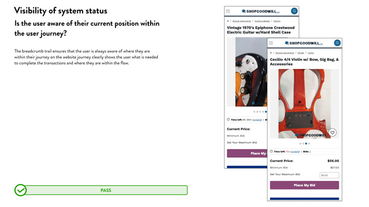
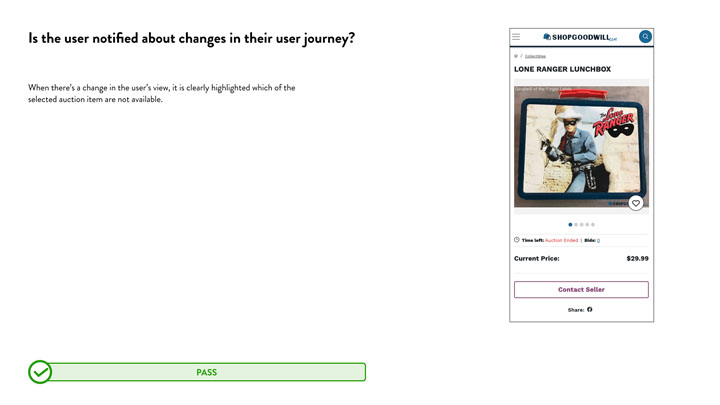
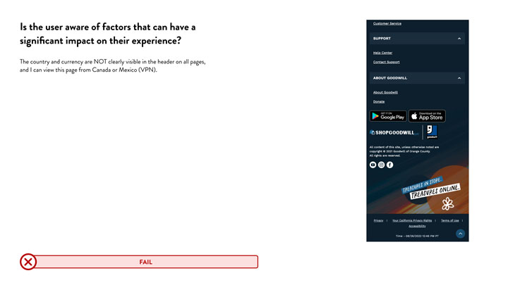
1.Visibility of system status
When you do some action or referring to a continuing process, the status should be clearly mentioned until it’s completion.
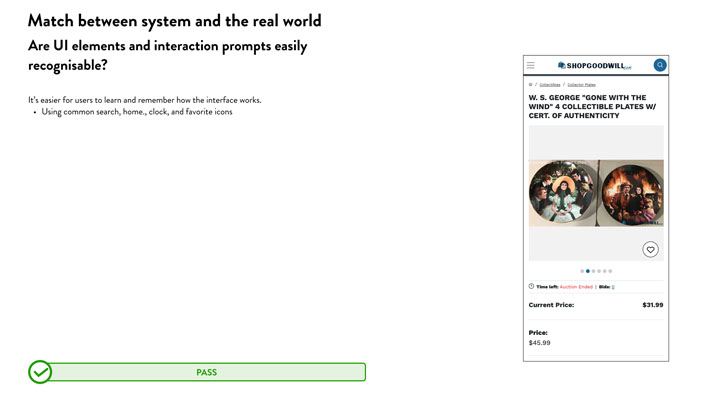
2.Match between system and the real world
Basically, it’s making the designs, interactions labelling and conversations more familiar to the real world.
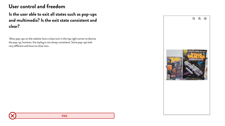
3.User control and freedom
Users often make mistakes and will require clearly marked emergency exits. Example: If you attached a large file in Gmail by mistakenly, you can cancel it before its fully uploaded.
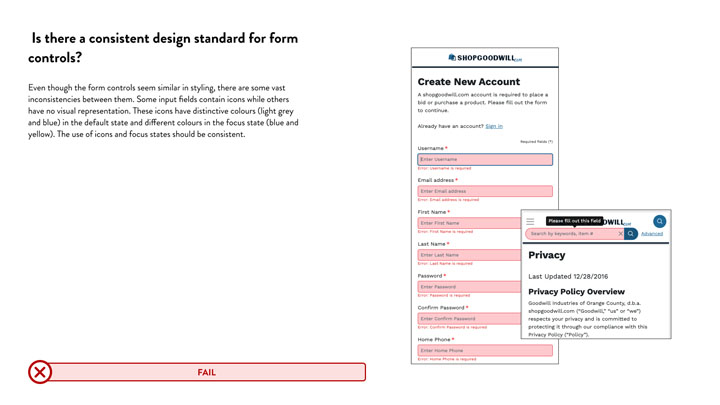
4.Consistency and standards
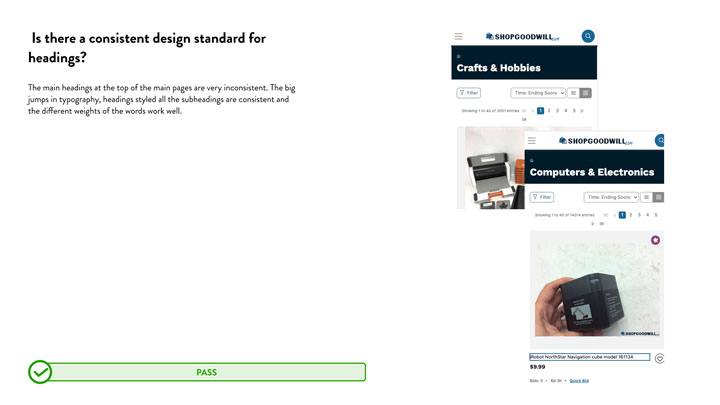
In an increasingly device-agnostic world, it is essential to create a consistent user interface throughout all devices.
%20on%20the%20website_.jpg)
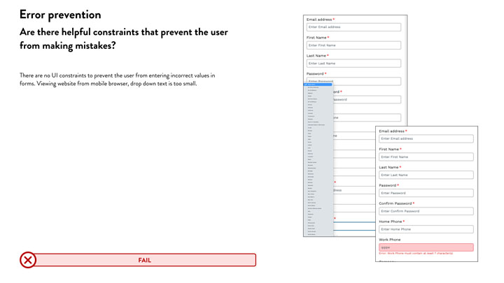
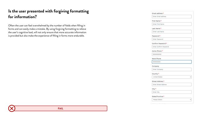
5.Error prevention
Thoughtful designs not only have good error handling, but prevent problems from occurring in the first place.
6.Recognition rather than recall
With the countless applications that we must interact with everyday, we do not want to waste valuable mental real estate with the nuances of everyone.
7.Flexibility and efficiency of use
This heuristic can be more challenging to follow and implement. However, your design should create a positive experience for novice and advanced users.
8.Aesthetic and minimalist design
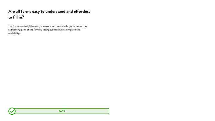
While being informative to the user, your design should also strive to be minimalistic. It is a delicate balance, but use visual cues rather than long, wordy instructions. A particular page should not include information irrelevant to a specific action.
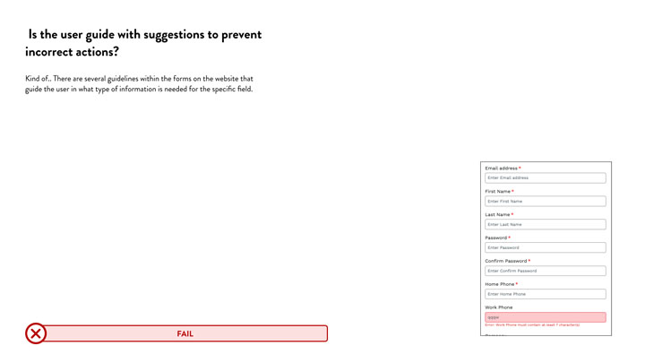
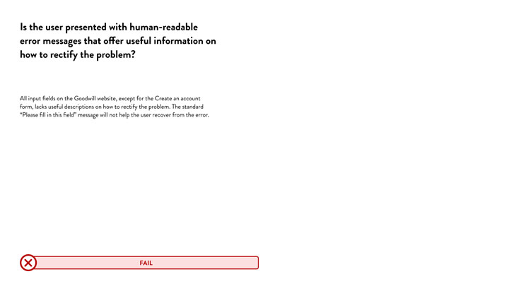
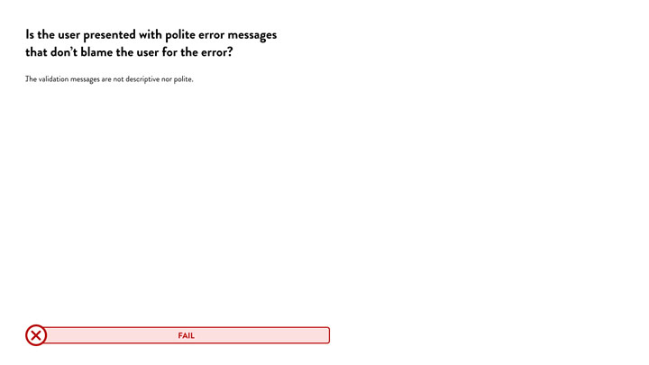
9.Help users recognize, diagnose, and recover from errors
When your application inevitably breaks, it is best to recover gracefully and smoothly for the user. Therefore, error messages should be in plain language rather than technical error codes.
%20when%20adding%20incorrect%20information%20in%20a%20form%20control_.jpg)
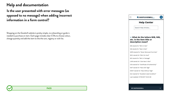
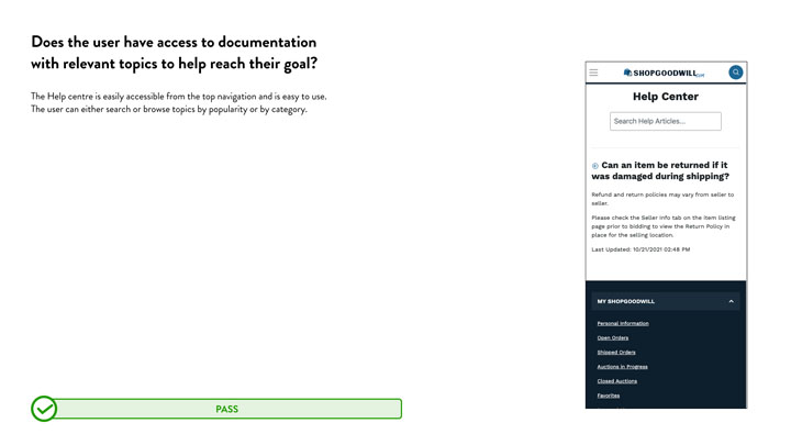
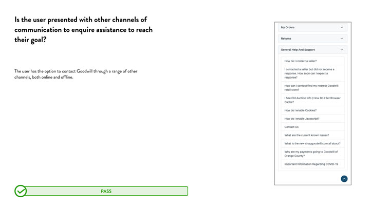
10.Help and documentation
While it is ideal for providing a user experience that does not require outside help, documentation is sometimes unavoidable. In addition, sometimes, tasks can be complex and require additional information.