Problem
As our products scaled, we hit a familiar—but painful—barrier: inconsistency, inefficiency, and disconnect between design and development. Designers in Figma were creating components and styles that didn’t always translate cleanly into the React codebase. Updates in one place often failed to propagate to the other. Worse, feature teams kept reinventing shared UI patterns, wasting time and producing disjointed user interfaces. We needed a single source of truth—a design system that would bridge design and code, enforce consistency, and accelerate development across platforms.
Our challenge boiled down to these tensions:
- How do you align a Figma library and a React component library so changes are synchronized, not siloed?
- How do you enforce design constraints, behavior rules, accessibility, theming, and cross-platform consistency in a maintainable way?
- How do you manage governance—deciding when a new component is added or modified—without slowing innovation or creating bottlenecks?
The guiding question was: Can we build a design system architecture and process that unifies design and development, empowers product teams, and remains flexible as we scale?
Process
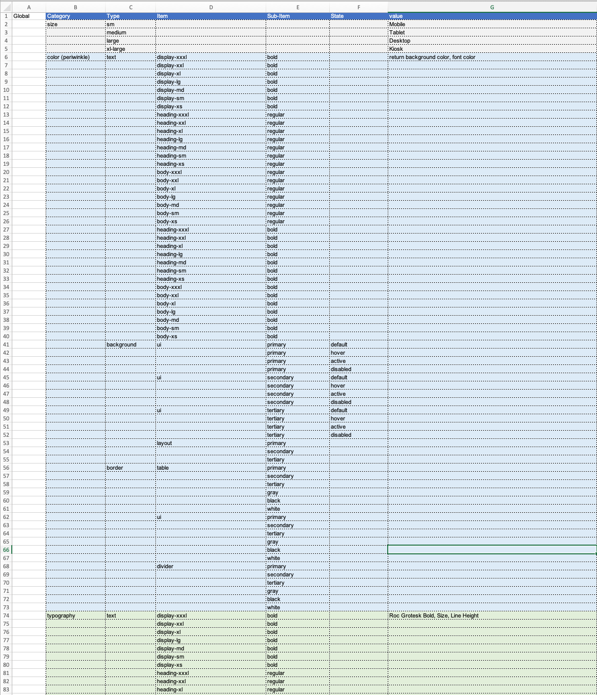
Foundational Architecture: Tokens + Components
I began by defining design tokens: atomic design variables (colors, spacing, typography, etc.) that become the foundation for all components. From there, each UI component would reference those tokens for styling and behavior. The system was designed to support multiple themes and platforms (e.g. light/dark, web/mobile).
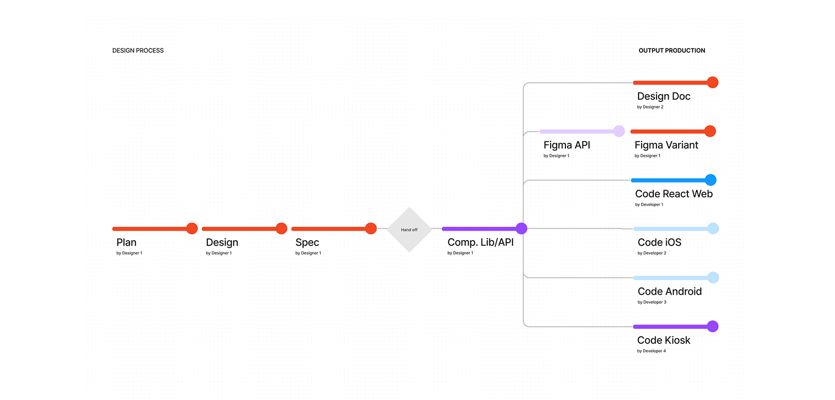
I designed a structure that allowed bi-directional synchronization: updates in Figma (e.g. a token value or variant) would feed into the React system, and vice versa. This meant choosing tooling and middleware that could translate design tokens into code, and ensuring naming conventions and structure matched on both sides.
Collaboration & Governance Workflow
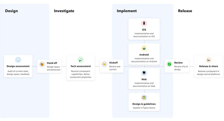
To integrate the system into product teams’ flows, I defined a “design assessment → tech assessment → kickoff → implementation → review → release” process:
- Design Assessment — Product designers submit proposals for new or changed components, including problem statements, use cases, and rough specs.
- Tech Assessment — Engineers evaluate performance, constraints, and feasibility of the proposed components or updates.
- Kickoff & Merge — Once designers and developers agree, the changes are merged in code and design repos.
- Implementation & Iteration — Designers refer to guidelines, define behaviors, and iterate through accessibility checks and cross-platform concerns.
- Review & Release — Components are reviewed for usage, edge cases, and compliance, then published with versioning and change logs. In Figma, we set a weekly update cadence for library syncing.
We held regular cross-discipline sync meetings so design, engineering, and product teams stayed aligned on evolving needs and constraints.
Prototyping, Testing & Iteration
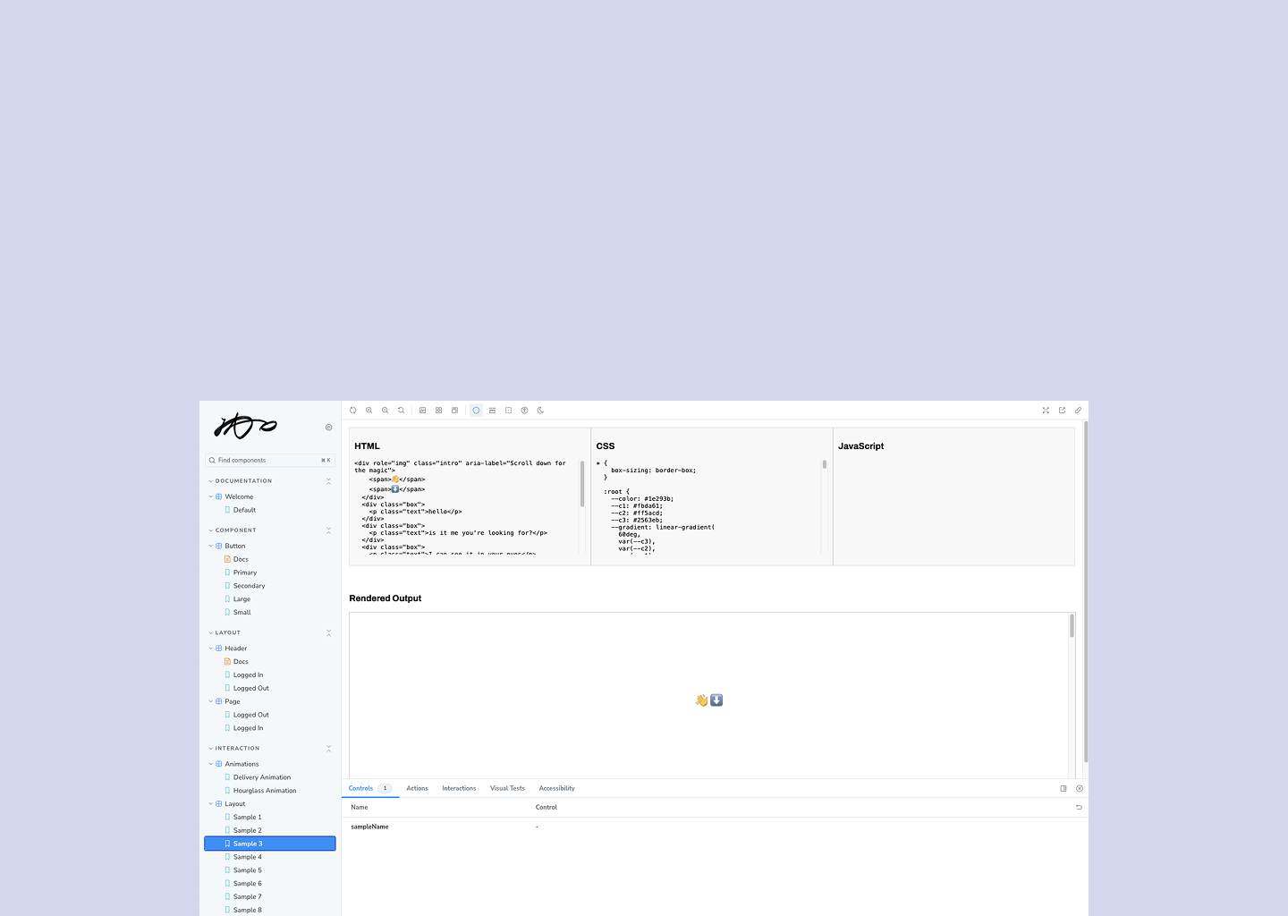
We built Storybook as a sandbox environment for UI components—isolated and interactive. Designers and engineers could view and interact with components across states and variants, test accessibility properties, and check documentation. This sandbox allowed rapid iteration prior to embedding components into features.
We conducted reviews across platforms (web, mobile) to ensure the same component behaved correctly under different constraints (responsive layout, interaction patterns, theming). Accessibility audits and QA feedback drove further refinements.
Impact
Implementing this design system fundamentally transformed how the organization built UI:
- Consistency & quality improved: shared tokens and component libraries reduced visual discrepancies and redundant implementation effort.
- Faster feature delivery: product teams reused existing components instead of rebuilding UI from scratch, which sped up development.
- Better alignment across design & code: changes in design flowed into code more reliably, and engineers gained clarity on behavior, variant rules, and constraints.
- Governance without bottlenecks: our assessment-to-release pipeline balanced flexibility and control, so the system could evolve without stalling product momentum.
- Scalability: with a solid architecture, adding new themes, platforms, or variants became much easier—and safer.
Reflection
Working on the design system taught me that the real work isn’t just building components—it’s structuring alignment, process, and culture. Even the strongest architecture fails if teams don’t buy in or use it consistently.
One key lesson: governance is as important as design. Without clear decision paths, requests to change the system can turn into chaos or paralysis. I learned that setting clear criteria for component additions, versioning policies, and sync cadences is essential.
Another insight: tool choice matters, but consistency does more. Whether using Figma plugins, token sync tools, or middleware, what ultimately makes the system work is discipline around naming, structure, and shared conventions.
If I were to do this again, I’d invest earlier in prototyping cross-platform integration (e.g. mobile + web) and more extensive feedback loops from product teams before making system-wide changes. Also, I’d build stronger analytics: track which components are most used, which get overridden often, and where mismatches occur.