Problem
When we looked at how motorbike delivery drivers were using existing tools, the friction was clear: they had to juggle many moving parts—job offers, picking up orders, navigating, coordinating with restaurants/customers—all while on the vehicle. The current experience felt fragmented and clunky, especially for new drivers who were still finding their footing.
Key tensions emerged:
- Onboarding vs efficiency — new drivers need extra guidance, while experienced drivers want speed and minimal distractions.
- Clarity vs overload — drivers need the right information at the right time (where to go, earnings, status), but too much detail could overwhelm them mid-ride.
- Connectivity constraints — poor mobile network, latency, or data issues could disrupt flows.
I framed the central question: How can we design a mobile app for delivery drivers that is simple, safe, and efficient—supporting both beginners and veterans—while accounting for context (on-road usage, interruptibility, connectivity)?
Process
Context & User Segmentation
I began by mapping out driver personas:
- First-time enrolled drivers — those just joining the platform, needing onboarding, clarity, and handholding.
- Experienced drivers — those doing 25-30 jobs a day, aiming for speed, optimization, and leveraging preferences or shortcuts.
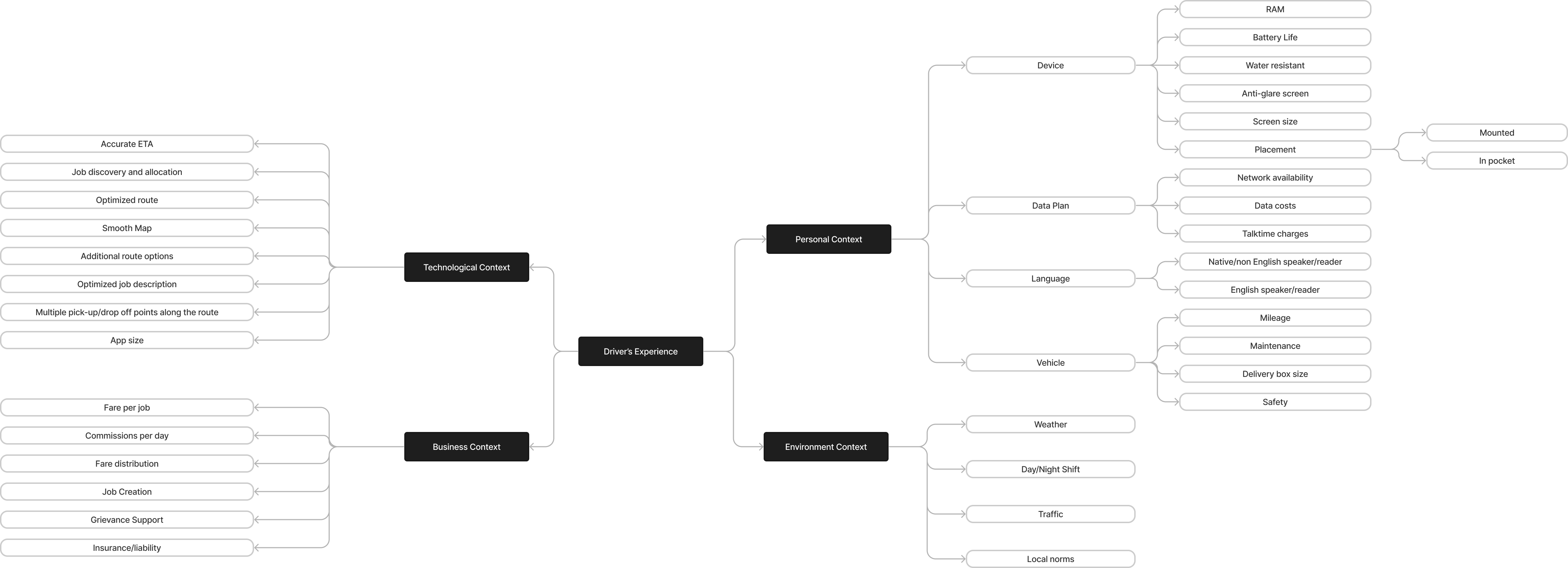
Next, I sketched the usage context: when (day/night), where (on the road, under motion), network conditions, safety constraints, and split attention. I built a mind map of contextual factors to guide design trade-offs.
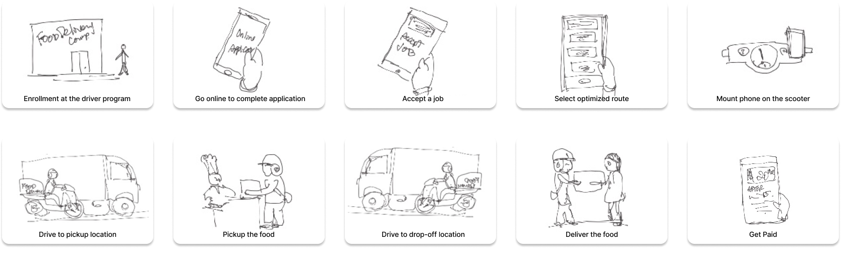
Storyboards & Journey Mapping
To bring the experience to life, I created a storyboard of the driver flow: receiving a job offer, accepting, going to restaurant, picking up, navigating to delivery destination, and completing. This helped me imagine pain points or opportunities at each moment (e.g., when a job is far away, when a driver is in motion, when network drops).
I surfaced concerns to stakeholders early:
- Job offers far from the driver’s current location
- Inability to accept multiple jobs along a shared route
- High data usage in the app
- Unreliable performance on slow networks
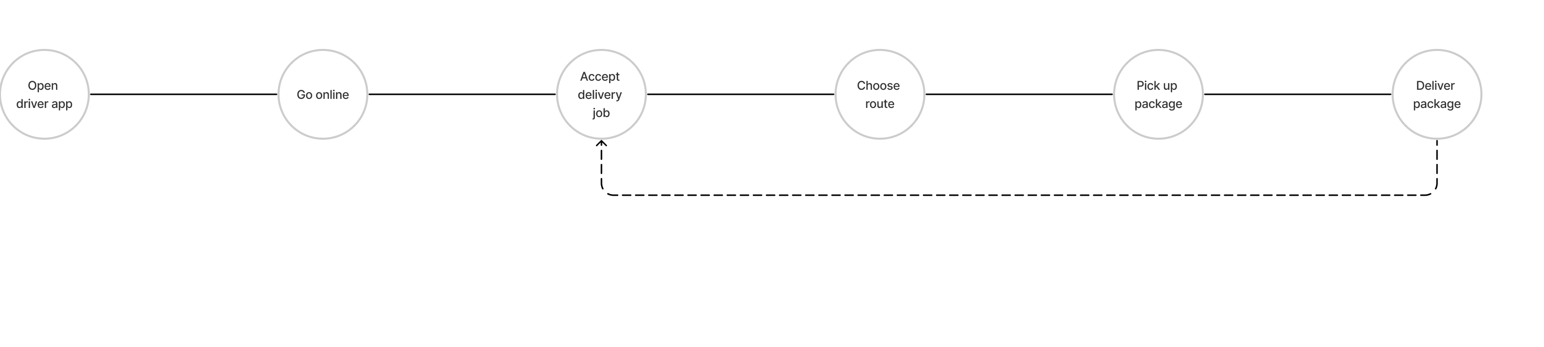
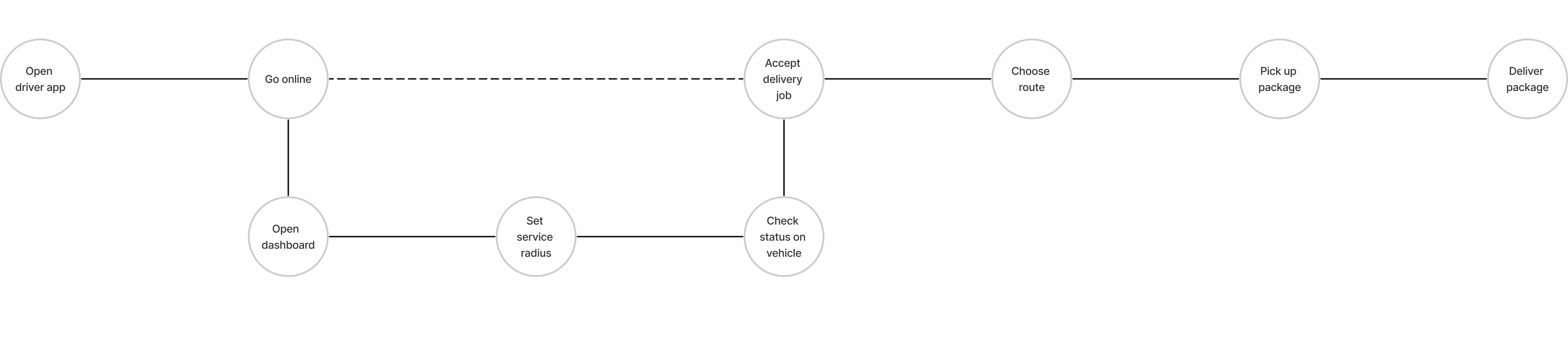
I then formalized a user journey (explore → exploit):
- Explore: As onboarding, allow a complete end-to-end trial so new drivers learn the full flow with minimal friction (via progressive disclosure).
- Exploit: Once familiar, drivers can set preferences, take optimized routes, and let the system feed them better job suggestions and bonuses.
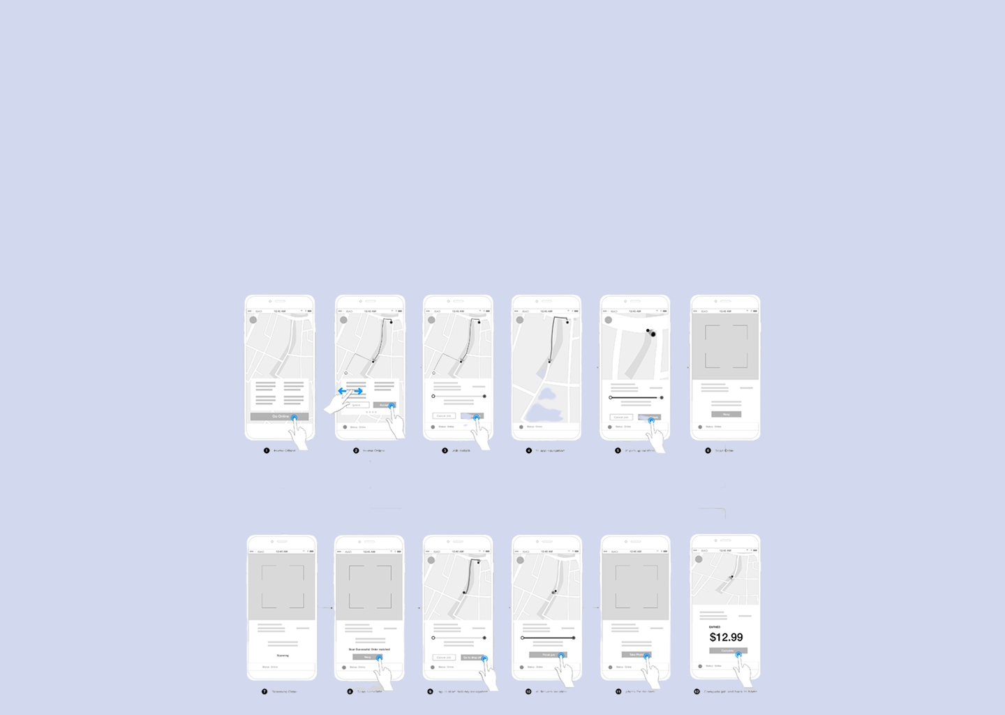
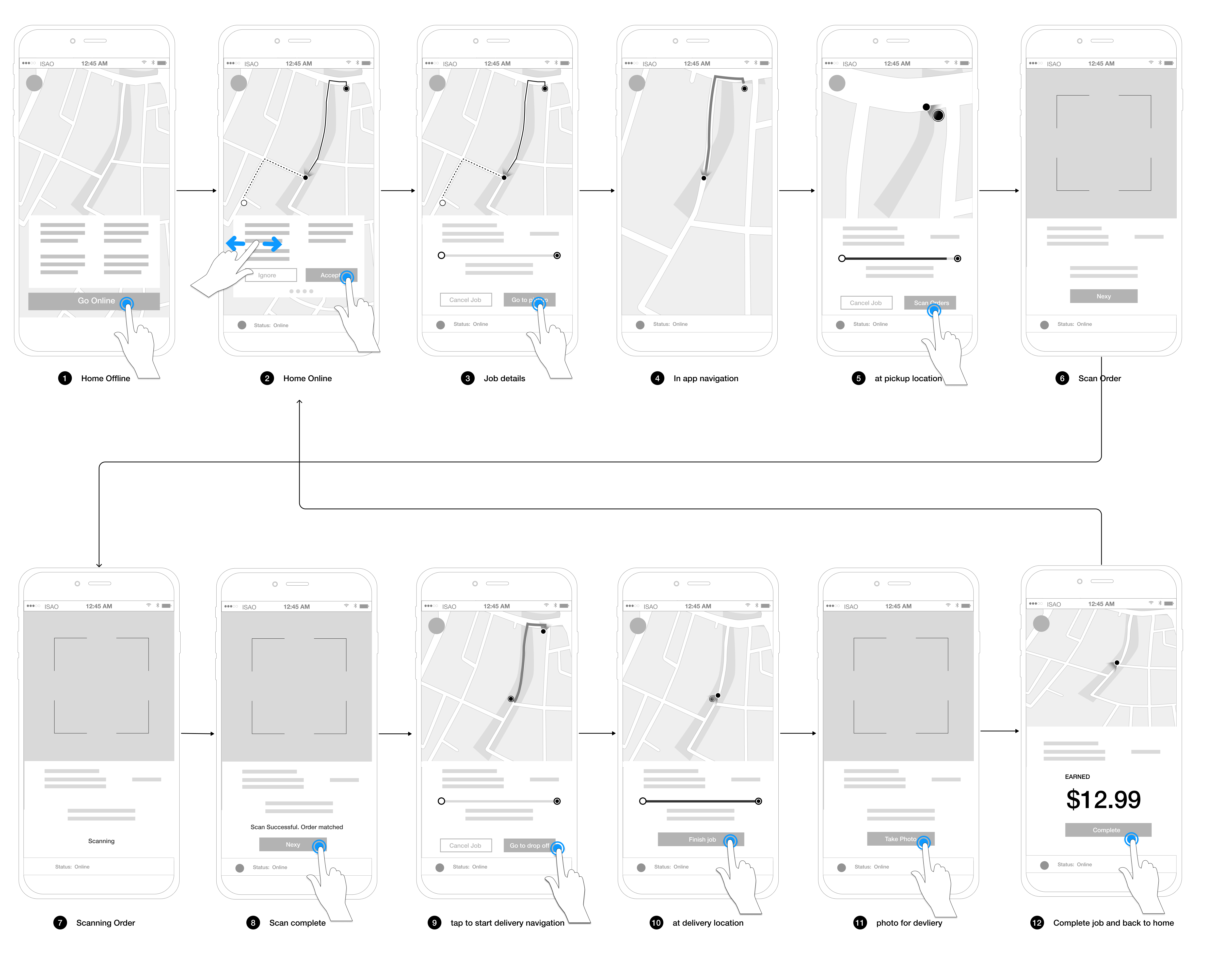
Information Architecture & Wireframes
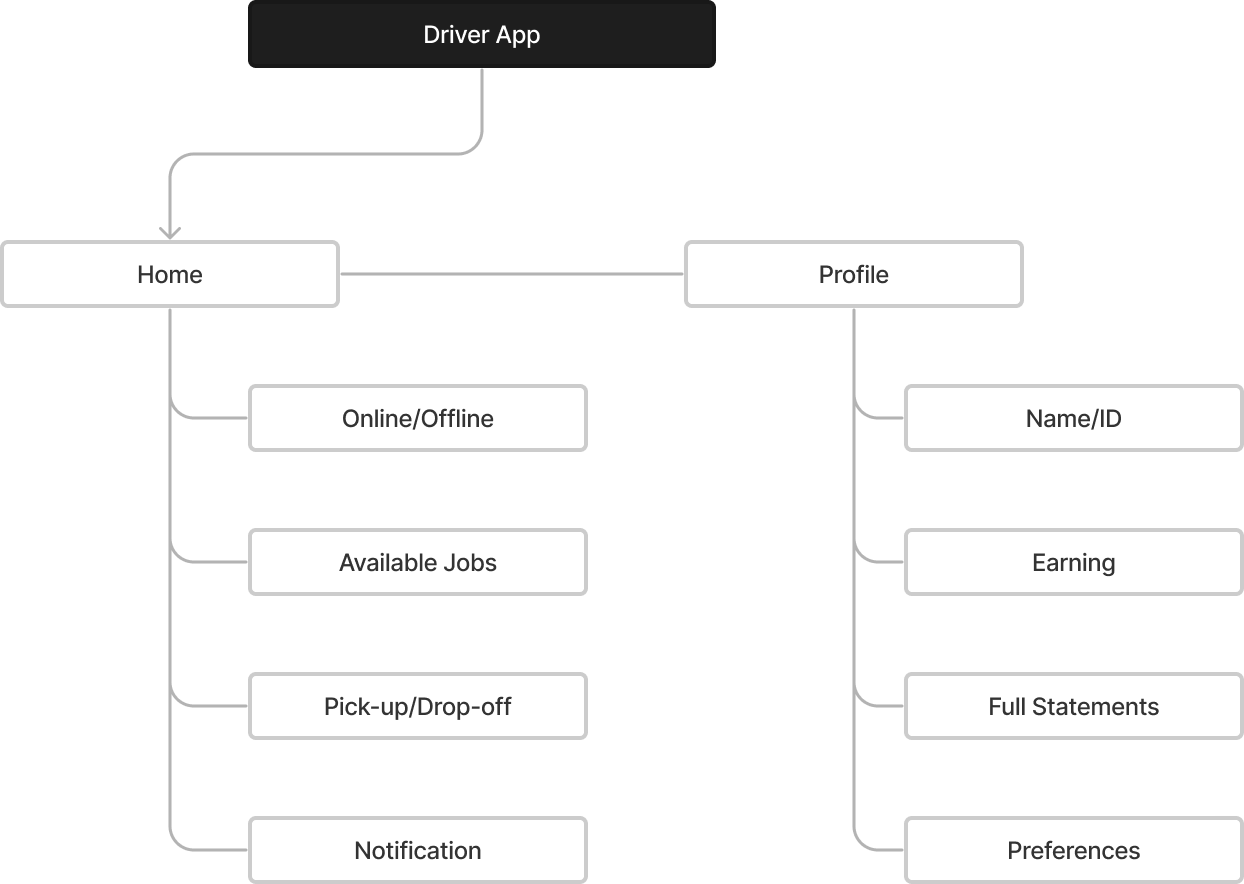
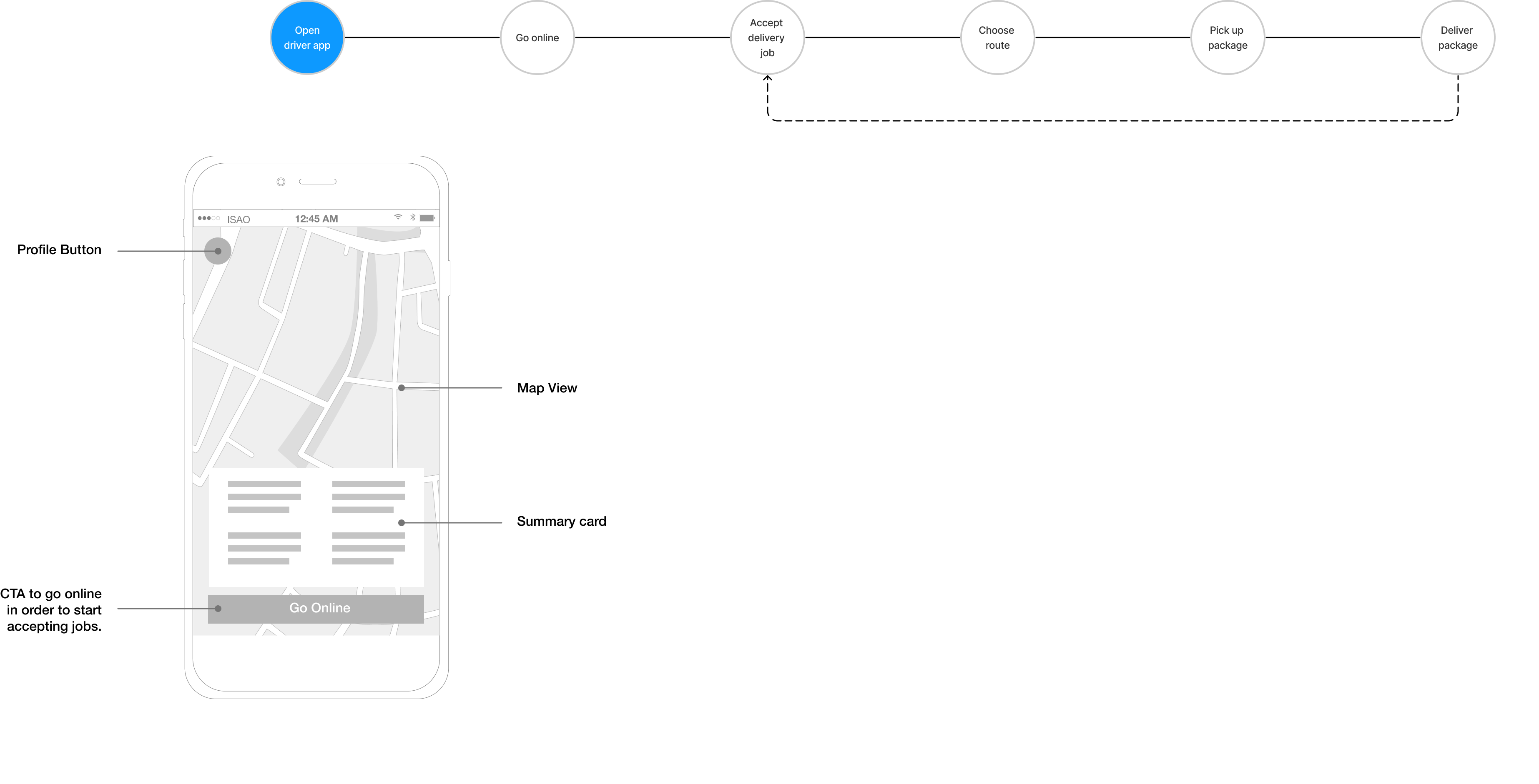
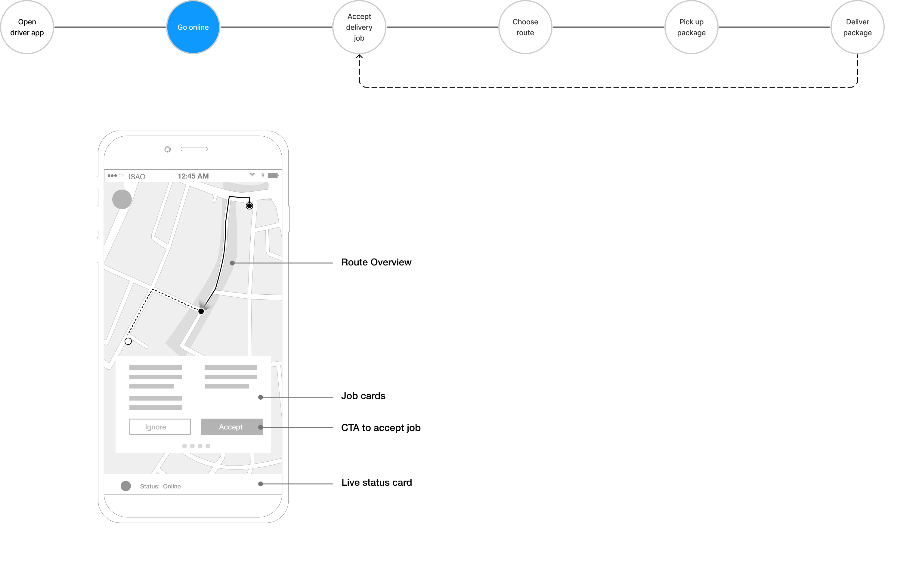
I prioritized a single entry point architecture: start from a home screen where drivers can “Go Online,” then seamlessly transition through jobs. Key screens included:
- Home with status summary, announcements, and CTA
- Job cards listing available jobs (pickup → dropoff, fare estimate, time)
- Route overview map
- Pickup / dropoff interaction screens
- Profile / preferences screen
I created low-fidelity wireframes showing navigation flows, CTA placements, swiping or taps for action, and how major states should feel. I annotated within these to clarify behaviors, transitions, and decision logic for developers.
Visual Design & Mapping
I chose a clean, functional visual style—nothing trendy, so it would remain durable. Typography followed Material or iOS system guidelines (e.g. SF Pro).
For maps, I used Mapbox with custom styling to match our branding. I prototyped map views in Framer X to test how the map visuals, route overlays, markers, and orientation would integrate with the rest of the UI.
Impact
While this was a design proposal rather than a full production launch, the work delivered substantial value:
- The flow design and wireframes gave engineering teams a clear blueprint for a driver-centric product.
- Stakeholders gained shared empathy: through storyboards and journeys, they better understood the “in-motion” challenges drivers face.
- The architecture (one main entry point, progressive onboarding) addressed the balance between newcomer support and veteran efficiency.
- The visual system and map integration provided a consistent, brand-aligned look and feel that supports long-term maintainability.
The design also surfaced critical constraints (e.g. data usage, network assumptions) early, which can help the development team plan fallback logic or offline modes before build.
Reflection
This project reinforced for me that context is everything. Designing for someone who’s actively on the road is very different than designing for someone sitting at a desk. You can’t assume perfect connectivity or availability of attention.
One key lesson: progressive disclosure is powerful. By hiding advanced options until drivers are comfortable, you reduce errors and cognitive load on day one. But you also need to ensure the path to complexity is clear and frictionless.
Another insight: mapping and real-world alignment matter. The map visuals must not only look good—they must reflect real road constraints, traffic, and driver mental models. Investing in testing map interactions early is critical.
If I were to iterate further, I’d want to instrument prototypes (e.g. in test rides) to see how drivers actually behave: where they hesitate, which transitions feel awkward, how latency impacts flow. Also, I’d build error recovery flows (e.g. job dropouts, network loss) much earlier in the design process.